In this week’s comments update, readers are discussing a patisserie in Thailand with a design that references French cathedrals and pastries.
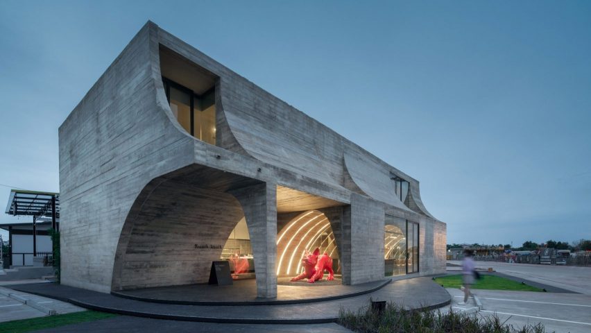
Created by Bangkok studio Touch Architect, the board-marked concrete building named French Kitsch III was intended to resemble the shape of a croissant. Readers weren’t all convinced that the design fit with the building’s purpose.

“Does not make for an a inviting food experience”
“But does it look and feel like a pastry shop?” asked Jean-Yves Rehby.
“So much concrete to sell a few croissants!” reflected commenter Cyr.
Souji took a more blunt view and deemed it “the most depressing patisserie ever”.
Jayarr8 was slightly more forgiving, writing “while I laud the overall design, the dark grey interiors, especially the ‘dirty’ concrete do not make for an a inviting food experience”.
One of the few commenters to express their full approval was Duckusucker, who hailed it as “fun and beautiful”.
Piping hot or ice cold? Join the discussion ›

“Calm and quiet”
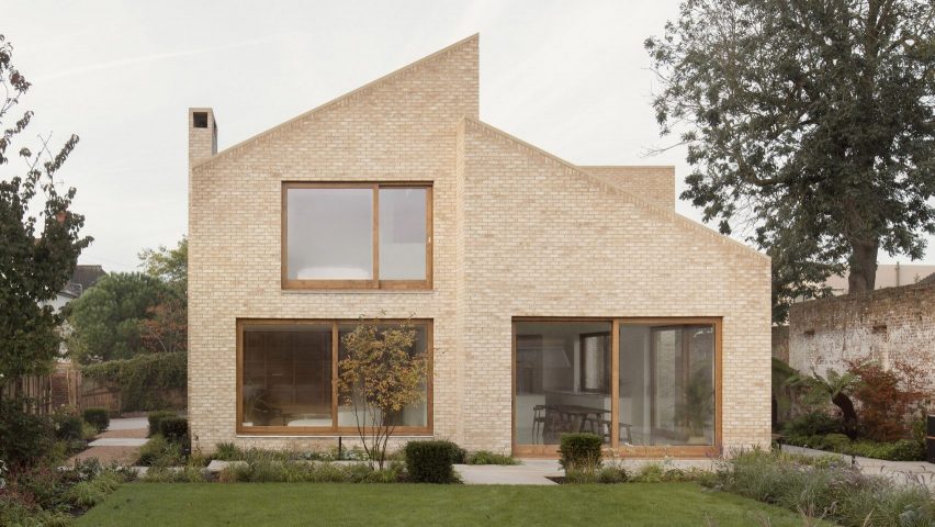
Readers were undecided about a timber-framed house in Wimbledon with three mono-pitched structures unified by buff-brick cladding.
Although I find the floors a bit cold, I reckon this is a great home for a family,” wrote Leo. “I love the brickwork,” they added.
“Calm and quiet – very nice,” admired Mr J. But they did suggest that “some plantings and baskets around the walls would add some interest”.
For Pieter Voogt, there were “a thousand missed opportunities for ornamental, playful and expressive bricklaying”.
Are you a fan? Join the discussion ›

“Playful and elegant”
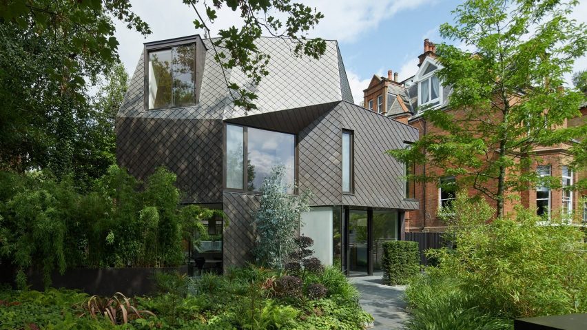
Also on commenters’ radars this week was an angular, copper-clad home completed by Alison Brooks Architects in London.
“Beautiful materials used in this project” praised Z-dog.
Orangikaupapa concurred, describing the dwelling as “playful and elegant”. They applauded how “the prevailing red brick of bits of Belsize Park [are] neatly echoed and counterpointed in the copper” before concluding “very satisfying”.
Other commenters weren’t so keen. “It looked promising from the outside but painfully common on the inside,” wrote Tom Roberts.
Chris was on the same page, writing “a lot of exterior gymnastics, the interiors seem pretty staid by comparison…”
What do you make of this angular home? Join the discussion ›
Comments Update
Dezeen is the world’s most commented architecture and design magazine, receiving thousands of comments each month from readers. Keep up to date on the latest discussions on our comments page and subscribe to our weekly Debate newsletter, where we feature the best reader comments from stories in the last seven days.

