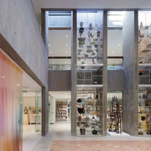
Los Angeles studio Milliøns has updated the east wing of the Everson Museum of Art in New York state designed by architect IM Pei, introducing reflective and colourful materials to a below-grade space.
Located in Syracuse and completed in 1968, the Everson Museum of Art (The Everson) consists of three storeys of interlocking concrete volumes organised around a central atrium and contains a collection of mostly American art and ceramics.
Milliøns was originally set to design the new Louise cafe for the museum, but the project expanded to encompass the entire east wing following discussions with the studio’s co-founders, Zeina Koreitem and John May and museum director Elizabeth Dunbar.
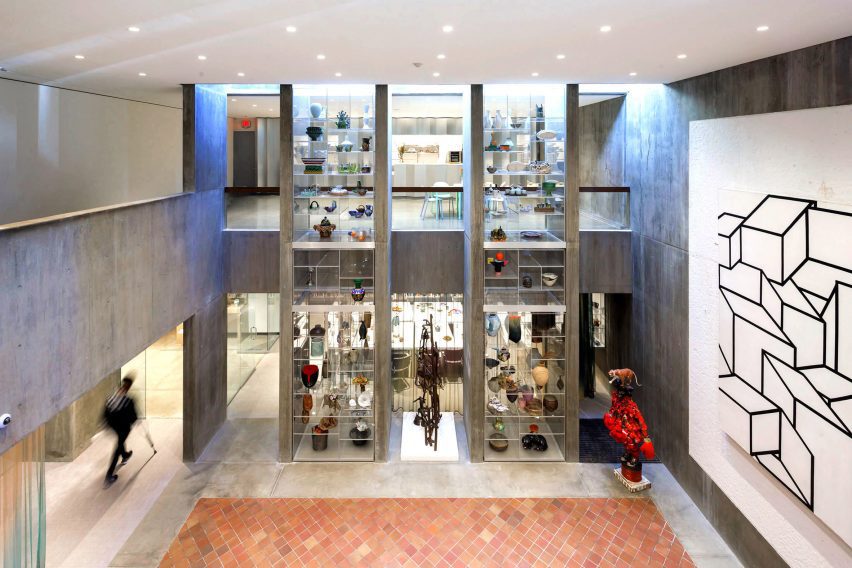
The East Wing is located in a slim rectangular volume affixed to one side of the building, and encompasses a below-grade space that is connected to a second-storey balcony through an atrium.
“The designers were inspired by Pei’s Brutalist masterpiece, and specifically by the way in which Everson’s massing produces intense contrasts of darkness and light,” said the team.
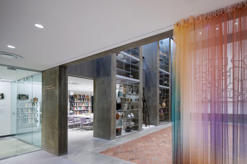
The cafe and a gallery wrap around the atrium on the second storey, while administrative spaces, an open space and a library sit on the lower level.
Milliøns not only integrated more light into the entire wing but sought to disperse a mixture of programming throughout the space, which had originally been divided between public galleries and private space for the museum’s staff.
“The East Wing has always had an ambiguous relationship with the rest of the museum,” said the team. “The upper floor is publicly accessible, but the lower floor is only accessible to staff, despite the fact that they are both joined, visually and acoustically, by a double-height atrium called Mather Court.”
“The redesign turns the lower level into a semi-public space for events and exhibitions while creating a new research library and renovated staff offices.”
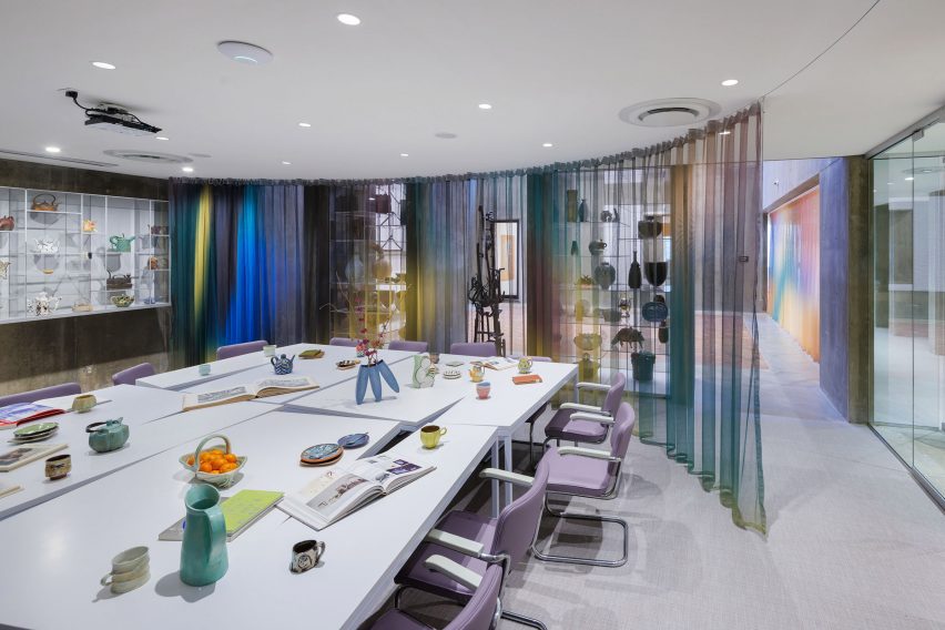
To offset the darkness of the subterranean lower level, the studio integrated colourful and reflective surfaces and materials throughout the entire wing.
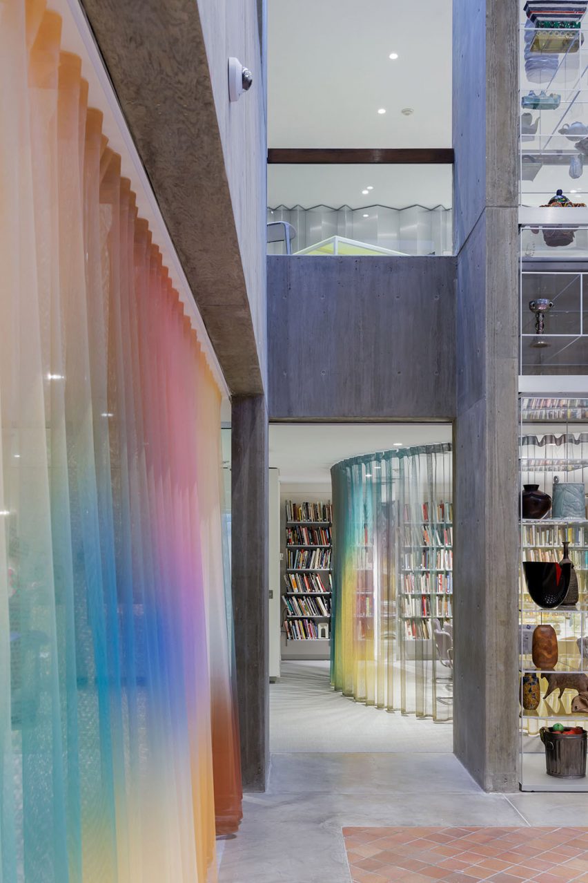
“We wanted to create a contrast between the existing rough, desaturated textures and the inserted reflective, hyper-saturated textures,” said the studio.
“We like to work with color as a kind of volumetric finish rather than a secondary or superficial layer.”
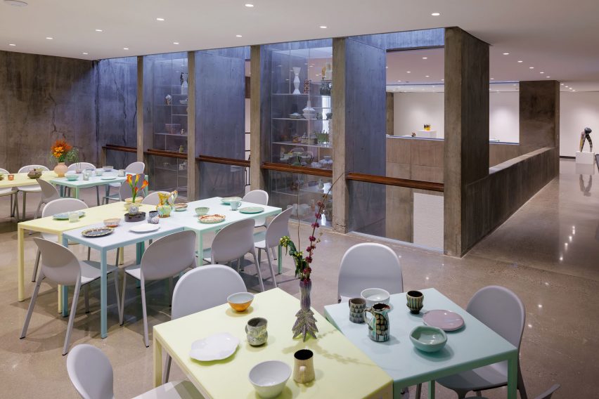
The studio created two “glass towers” between the concrete structure of Mather Court to achieve the effect.
The towers display part of a collection of 4,000 ceramic objects donated by ceramics collector Louise Rosenfield, who gave the ceramics to the project with the note that they should used by the public, not just displayed.
“The design centers around a series of two-story glass towers that house the Rosenfield collection while bringing light into the space,” said the team.
“The towers feature open shelving, which will allow café visitors to reach in and pick out any ceramic object they want to eat or drink from – a rare blurring of the lines between art and the public.”
On the lower level, translucent, ombre curtains designed in collaboration with Paris-based artist Justin Morin and printed by 4 Spaces were installed as room dividers.
Custom tables by Milliøns outfit the lower library, while the studio refurbished other original furniture pieces by a host of designers including Eero Saarinen and Charles and Ray Eames, which were specified by Pei.
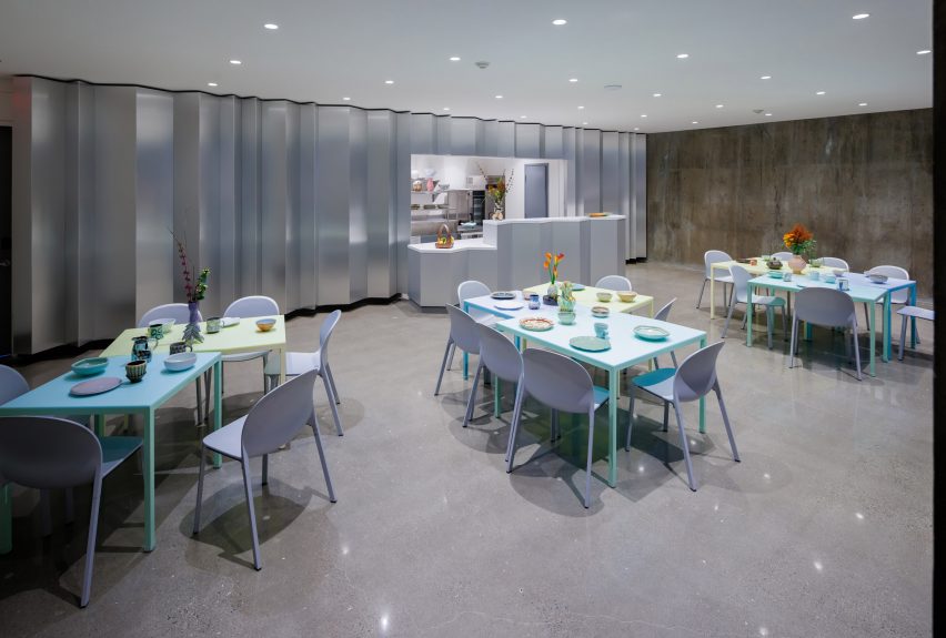
Milliøns also designed pastel-coloured tables for the small upstairs cafe, which were paired with light purple Olivares chairs by the director of Knoll Jonathan Olivares.
A reflective, chrome wall lines the back wall of the cafe where visitors place orders and a matching chrome countertop divides the space.
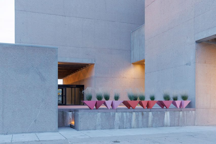
The project also included updates to the exterior of the building, where the team cleaned the facade “to reveal its pink tint”, restored original pavers, and lined a wall with geometric pink planters designed by Milliøns.
“In the end, much of the new work quietly asserts itself, while also receding into the background, materializing daylight and transforming the entire east wing, but with only minimal alterations to Pei’s original masterpiece,” said the team.
Milliøns is a Los Angeles architecture and design practice, founded by John May and Zeina Koreitem in 2012. The studio works across a variety of scales, including buildings, furniture and books.
IM Pei projects have been receiving updates across North America, including a tower in Montreal and the Rock and Roll Hall of Fame in Cleveland.
The photography is by Iwan Baan
Project credits:
Donor/collector: Louise Rosenfield, Dallas, TX
President & CEO Everson Museum of Arts: Elizabeth Dunbar
Rosenfield collection curator: Garth Johnson
Curtains: Collaboration with Justin Morin
Fabric and printing: 4Spaces, Zurich
Café chairs: Knoll Olivares chairs by Jonathan Olivares
Communal Café tables: Designed by Milløns (Fabrication in Los Angeles by California
Carts)
Research library and offices furniture: Originals by Saarinen, Knoll, Breuer and Eames,
spec-ed by IM PEI – reupholstered and refurbished by Milløns
Reconfigurable Library tables: Designed by Milløns (Fabrication in Los Angeles by
California Carts)
Prismatic towers fabrication: Custom FRANK Showcase system, Germany
Prismatic towers structure: TriPyramid structures
Cafe metal fabrication: Kammetal Inc.
Lighting design: Derek Porter

