Italian automaker Lamborghini has unveiled a rebrand featuring a flat, simplified logo as part of a broader “transformation process” aimed at sustainability and decarbonization.
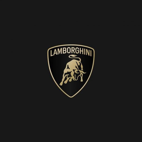
The logo has the same set-up – a bull placed at the centre of a shield, but the detailing has been pared down into a silhouette, while a broader, thinner typeface was introduced.
“The new logo is redefined by a broader Lamborghini typeface than its predecessor and by colors that are minimal yet bold,” said the company.
“The restyling is driven by a new strategy that involves adapting the brand’s visual expressions to better reflect the ‘brave’, ‘unexpected’ and ‘authentic’ values of its mission.”
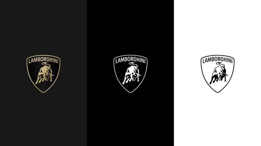
The logo, which will be applied to future car models, will be displayed in the classic gold and black, but also feature more pared-down black and white schemas.
Along with a “new set of icons”, the bull will be used across the company’s digital platforms, separated for the first time from its shield.
“The iconic bull in the center of the logo has undergone a major change,” said the company. “For the first time, it will exist individually on the company’s digital touchpoints, separated from the classic shield to lend it even greater prominence.”
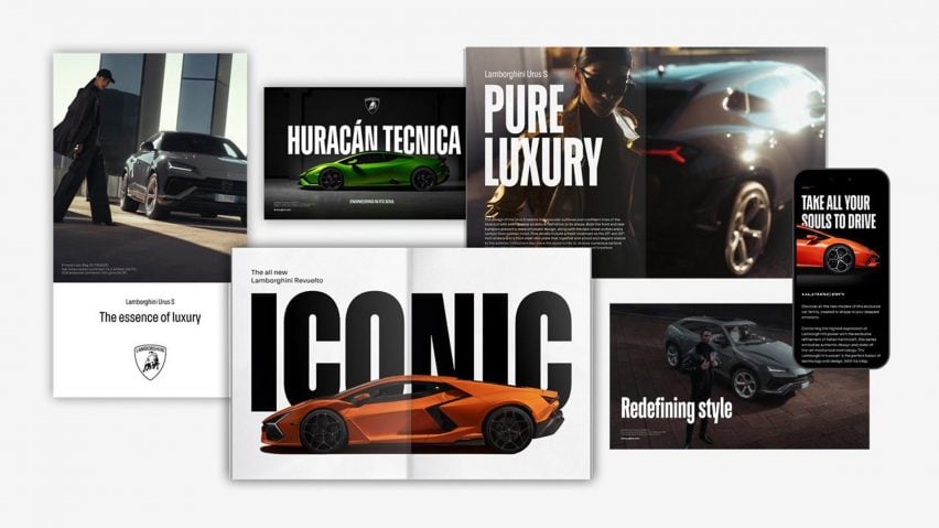
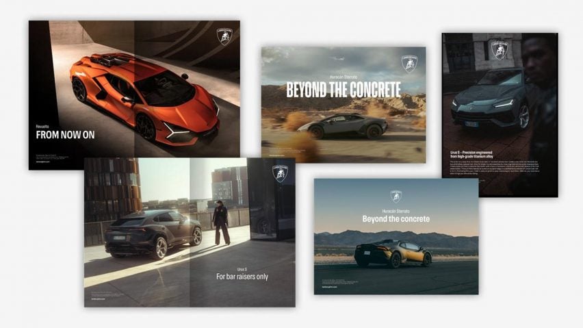
A new typeface was also created as part of the rebrand which echoes “the unmistakable lines and angularity of the cars” and will be used across communications.
Images of the typeface show a lean, tall san-serif font with hooked curves.
The new logo and typeface will be used on all the company’s official channels, according to the brand and is the first rebrand the company has undertaken in two decades.
It is part of a larger shift towards sustainability and decarbonisation, according to the company, summarized in its Direzione Cor Tauri plan.
The initiative, launched in 2021, outlines a plan to build the first fully electrified Lamborghini model by the “second half of the decade”, with hybrid models created along the way.
According to the company, the original logo can be traced back to founder Ferruccio Lamborghini’s penchant for bullfighting. The Miura bull, known for its aggressiveness, has been featured on the logo since the company’s founding in the 1960s.
The rebrand joins several car companies shifting towards a flat, simplified logo in recent years, including Volvo in 2021 and Audi in 2022.
The images are courtesy Lamborghini.