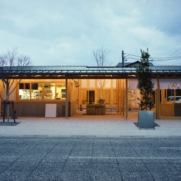
Timber pillars and PVC pipes were left bare to blur the boundaries between the interior and exterior of cafe and sweet shop in Funamachi, Japan, designed by Schemata Architects.
Named Funamachi Base, the combined sweet store and cafe is located next to a park in the centre of Funamachi, a riverport town in central Japan.
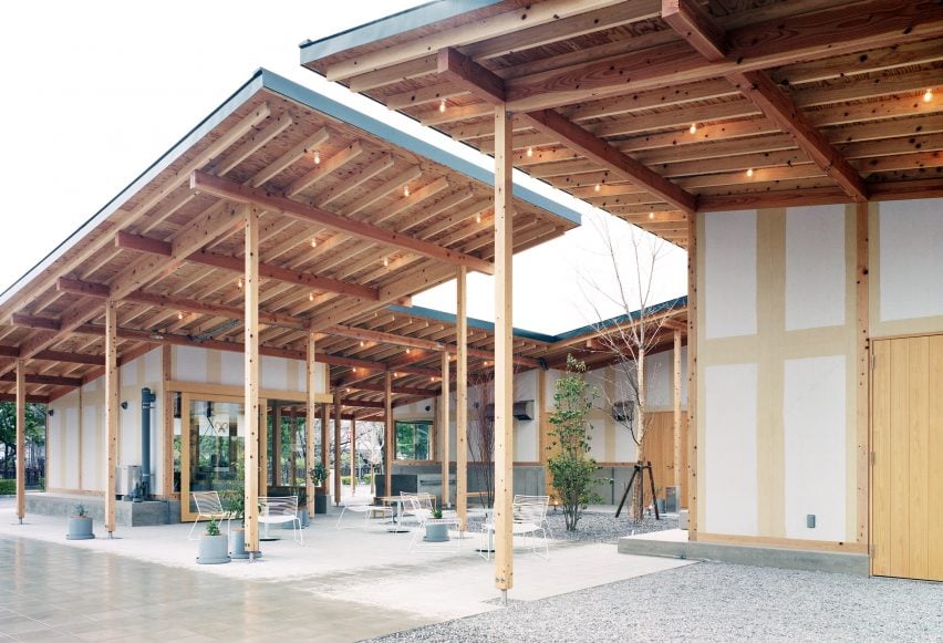
This location inspired the design of its three buildings, which house a restaurant, sweetshop and a structurewith an office, kitchen and workshop.
“We envisioned the facility as an extension of the park, including the courtyard connected via flowerpots, so that the boundary between the inside and outside of the site would disappear and one would be gradually drawn inside,” the studio said.
Schemata Architects’ founder Jo Nagasaka told Dezeen that the aim was also for people to wander into the space as they walk along the river.
“The main idea was to incorporate the greenway along the river into the facility,” he said. “The design is based on the expectation that people will find themselves entering into the shop as they walk along.”
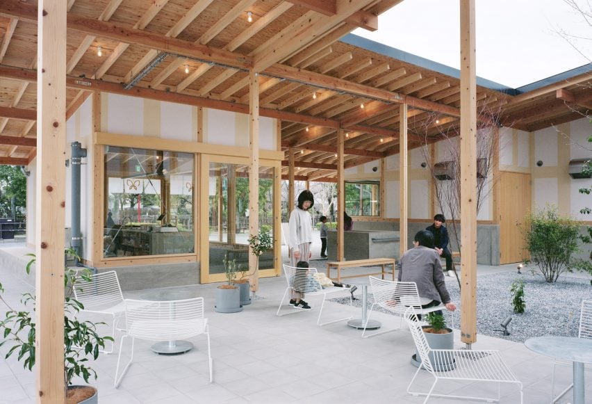
Large roofs extend out from the buildings of the 326-square-metre Funamachi Base, creating sheltered spaces where visitors can sit and enjoy the cafe’s bean buns.
“The distance between each building is taken and a roof is placed between them to create a semi-outdoor space, but to avoid clear boundaries between the inside and outside, the idea was to use the same materials inside and out,” Nagasaka said.
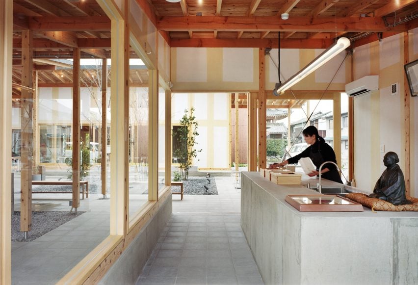
Made from concrete and Douglas fir wood, Funamachi Base also features visible PVC pipes, a design choice that Schemata Architects made to underline the interaction between the interior and the exterior.
“The same materials were used inside and outside: calcium silicate board and putty coating, PVC pipes generally used for outdoor gutters were sandblasted and placed across the inside and outside of the building, and the eaves extended to create a space where the inside and outside are interchangeable,” the studio said.
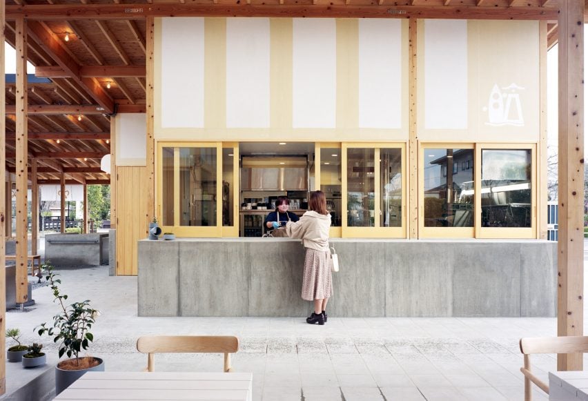
The foundation of the building was designed to bulge out, forming a counter from which to sell the sweets.
It was also used to create a bench for visitors to rest on and a well, as water is needed to create Japanese sweets.
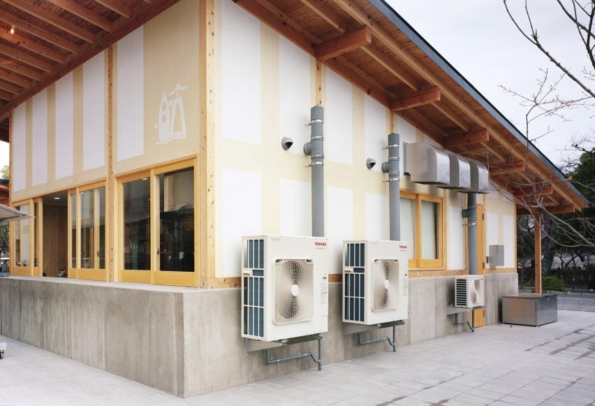
The facades of the buildings have a light-brown pattern, adding to their industrial feel.
“White walls would make it look like a stylised Japanese building, so we dared to deviate from that,” Nagasaka explained. We have chosen this so that the construction process is reduced and the finish is unusual.
Schemata Architects recently designed the Komaeyu bathhouse in Tokyo, which was shortlisted for a Dezeen Award 2024 in the interiors category.
The photography is by Yurika Kono.
Project credits:
Architect: Jo Nagasaka / Schemata Architects
Project team: Yuko Yamashita
Construction: Giken
Collaboration: Monochrome (solar panel integrated roof), Fukushima Galilei (kitchen)

