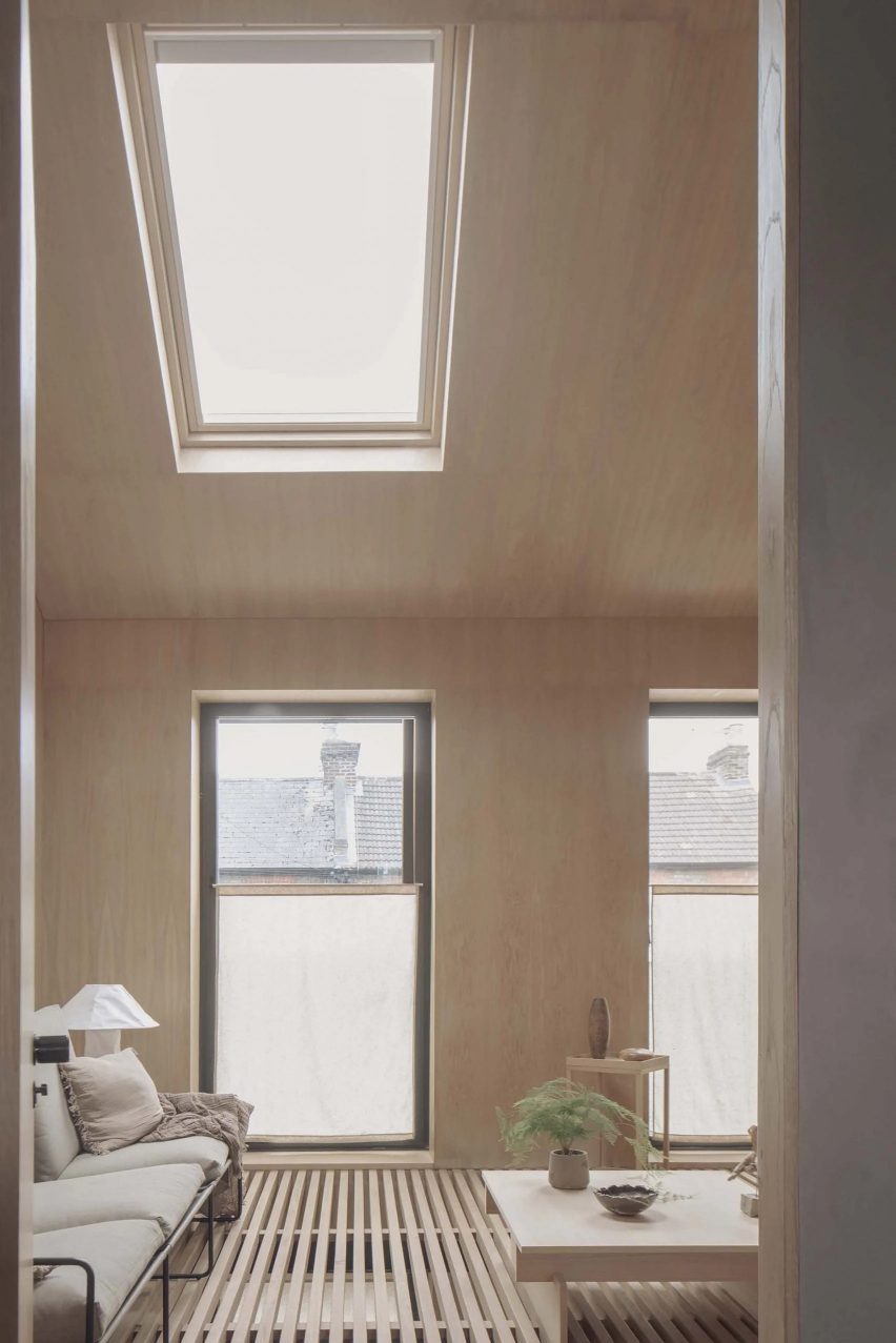
In this week’s comments update, readers are discussing a home in north London with a timber-slatted floor by local practice S2B Studio.
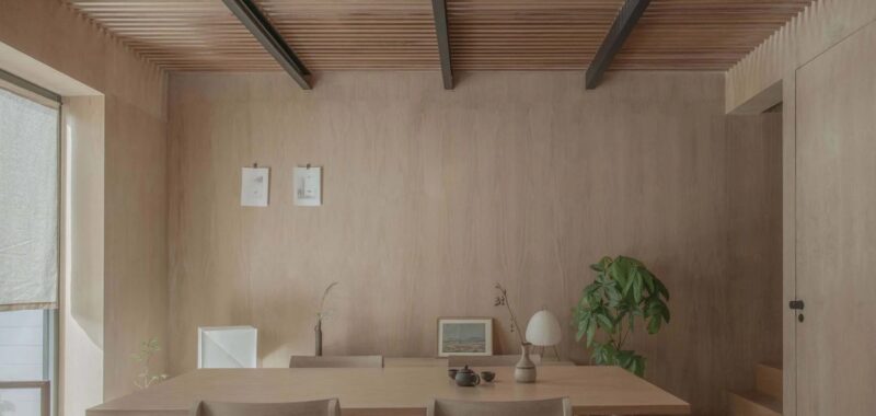
Named Cooper House, the two-storey home has a timber structure and a natural material palette dominated by wooden finishes, including wooden slats that form a semi-open floor on half of its upper level.
Commenters were unsure about the functionality of the design.

“The pragmatics of an open floor seem horrible”
“Slatted floors go beyond me,” declared Dik Coates, before concluding “I cannot think of anywhere that this would be appropriate”.
“This is all concept and no practicality,” determined RichieM. “Would anyone actually feel comfortable living day-to-day in this space?” they asked. “Beautiful to photograph, but doesn’t account for how people actually live”.
“There’s some nice detailing in this house, but also some silly stuff like the impractical slatted floor,” agreed The Truth.
“Ouch, my mind already has my toes caught in those gaps, I then spill my scolding hot tea on my child’s head,” envisioned Fartwell Arson.
JZ also had their concerns, writing “love the idea, but the pragmatics of an open floor seem horrible”. They added “Walk with shoes: drop debris on all the furniture and heads below – walk barefoot: be ready to accept discomfort or maybe even a twisted ankle!”
Are you in favour of the slatted floor? Join the discussion ›

“Dubai on the Hudson continues its gangrenous poisoning of Manhattan”
Readers were also left unimpressed this week by additional images released by developer Related Companies of the SOM-master-planned Hudson Yards West skyscraper and casino development in New York, amidst an outcry from local advocates.
“Just because Las Vegas has the New York–New York casino, New York needn’t reciprocate with a Vegas–Vegas neighbourhood – nor should it,” condemned ScuffedShoes.
Keith Rowley agreed, posing the question “what does it say about a society when its tallest buildings are casinos?”
“Dubai on the Hudson continues its gangrenous poisoning of Manhattan,” reflected a disapproving Shannon Walker.
However, Cr put forward that “not much can get done without public backlash these days, whether it is warranted or not”.
What are your thoughts on the development? Join the discussion ›

“It looks immaculate”
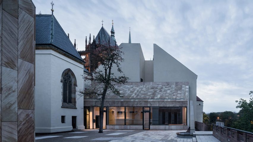
Dezeen comments struggled to reach a consensus on the renovation of a 19th-century provostry at St Vitus Cathedral in Prague by Czech practice Studio Acht, which included the restoration of original elements and the creation of two modern annexes.
Gorgeous project – the new extensions are rightly deferential to the masterpiece of the existing building,” commended Brian Anthony. Meanwhile, Don Bronkema simply put “bien-fait!”
However, other commenters weren’t so convinced of the harmony between the old and new elements.
“Normally a good addition blends right in. Here, the new buildings not only stand out too much, but they are just plain ugly to look at,” criticised Souji. “Slapping on some stone slabs isn’t gonna make it contextualised,” they added.
“But congratulations on the restoration, it looks immaculate,” they granted.
Commenter Arch was on the same page about the modern interventions, suggesting that “in comparison to the historical architecture, the new additions just look worse.
Gorgeous or just plain ugly? Join the discussion ›
Comments Update
Dezeen is the world’s most commented architecture and design magazine, receiving thousands of comments each month from readers. Keep up to date on the latest discussions on our comments page and subscribe to our weekly Debate newsletter, where we feature the best reader comments from stories in the last seven days.

